50 Best Websites for Web Design Inspiration and Ideas

Welcome to the best websites where to find examples and ideas for web design inspiration. Use them to...
Welcome to the best websites where to find examples and ideas for web design inspiration. Use them to identify layout styles and color schemes that you like. Quickly get over creator's block and start filling that blank page.
Most resources are free but there are also a couple of paid ones. Some of them are general while others focus on landing pages, ecommerce and portfolios. There are even a few ultra niched ones for footers, navigation and interaction examples.
To make it easier for you to find the right resource I've structured the roundup.
Multipurpose inspiration
General websites where you can find ideas for a wide range of projects like business, landing pages, portfolios, ecommerce and more.
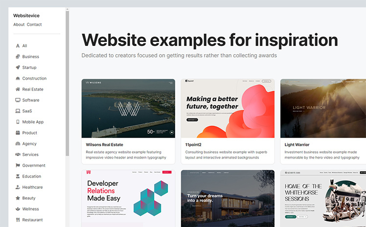
Websitevice
Websitevice is a new web design inspiration gallery showcasing a wide range of examples. You can easily filter displayed items based on popular use cases. The website is young but growing fast with fresh content added regularly.
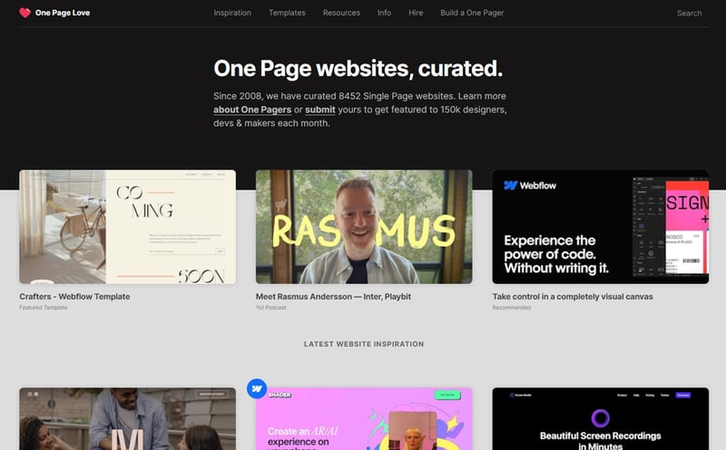
One Page Love
One Page Love is a superbly curated collection of website and landing page inspiration. Each featured example is designed to the highest standards by top agencies and makers. You can easily select your desired use case from the navigation menu.
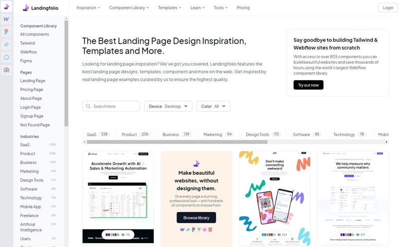
Landingfolio
Landingfolio is an established source of web design ideas. It features an impressive lineup of beautiful, marketing optimized items. Besides use case you can also filter results by page type: home, pricing, about, sign up and more.
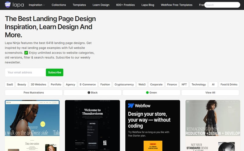
Lapa Ninja
Lapa Ninja provides a tastefully curated collection of website design examples. Visitors can choose between use case categories and color filters. The resource stands out due to the full screenshots of multiple pages for each item.
Godly
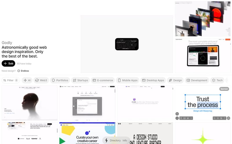
Godly is probably one of the most dynamic web design inspiration resource in the roundup. All project covers are animated and go beyond presenting the examples headers. You get a better overview by seeing the page scroll recording.
Siteinspire
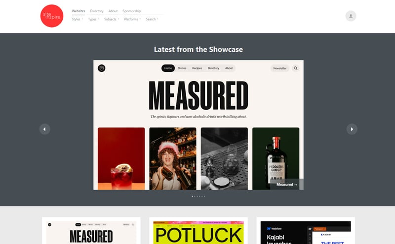
Siteinspire does a great job of showcasing the finest web designs that keep visitors inspired. The generous amount of items can easily be sorted based on style, type, subject and platform. What I don't understand is the incredibly small font size but it's not a major drawback.
Maxibestof
Maxibestof is a reliable source of website design ideas carefully curated by an accomplished product designer. It's easy on the eye, a pleasure to navigate and offers a wide range of categories. Each item gets a full screenshot on the details page.
InspoVault
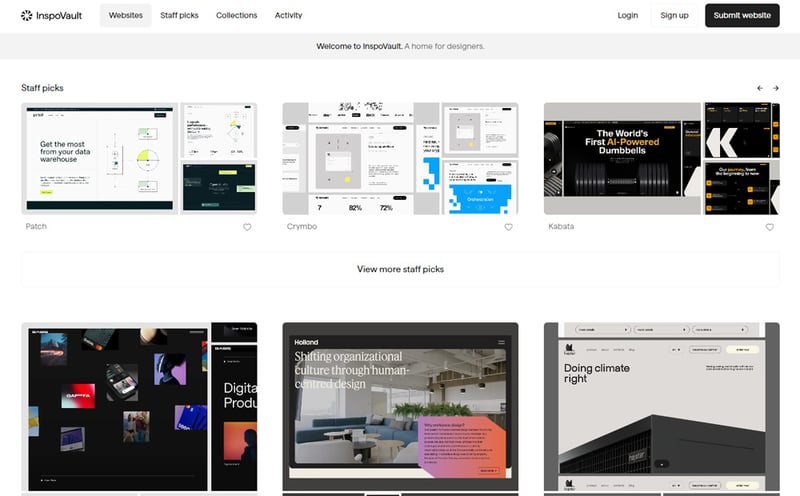
InspoVault has a different approach by focusing more on quality and less on quantity. So while you don't get to browse through hundreds of website examples at least you'll definitely enjoy the ones featured. Especially if you're into minimalist, large typography, creative style.
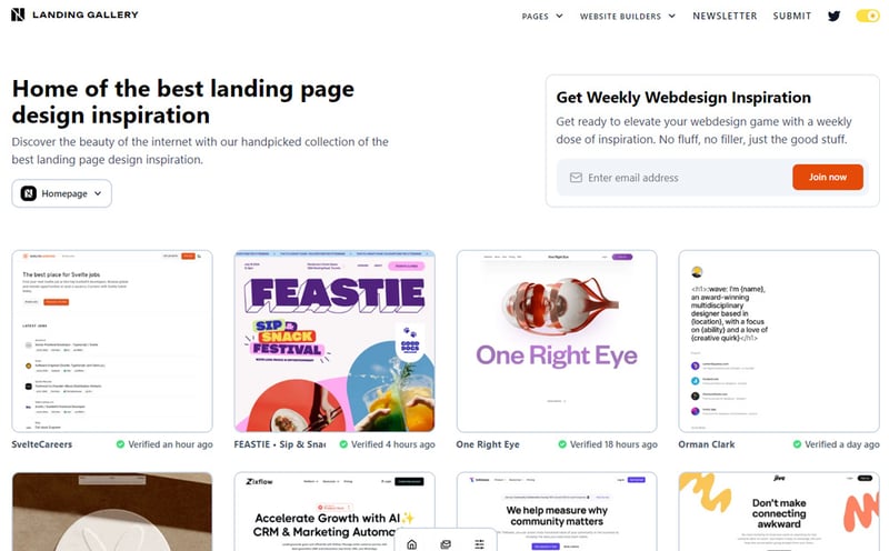
Landing Gallery
Landing Gallery is the home of awesome landing page design inspiration. Clicking on items takes you to a complete details page with full screenshot, brief description, color scheme and project link. In terms of filtering you get page type home, pricing, about, contact and more.
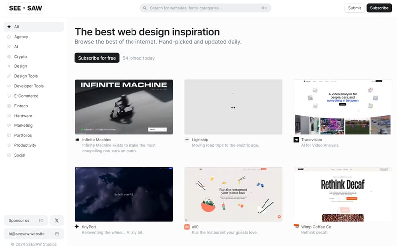
SEE + SAW
SEE + SAW has a strikingly dynamic interface with high speed video covers for all website examples. Members of the youthful audience will probably appreciate this approach more. For me it's a bit overwhelming. Nevertheless you definitely get a better overview of each project before clicking on it.
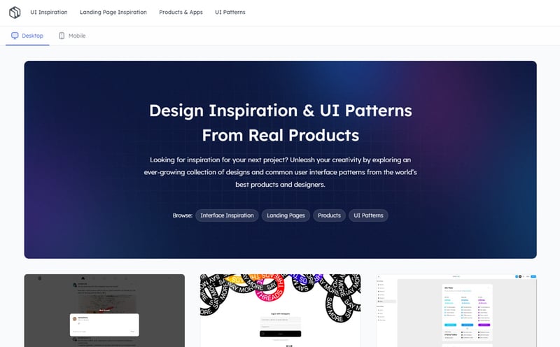
Design Vault
Design Vault helps makers unleash their creativity by providing an ever-growing collection of web design and UI inspiration. Besides the regular desktop screenshots you get the opportunity to browse mobile screenshots too. Items are carefully selected and definitely worth the sign up requirement.
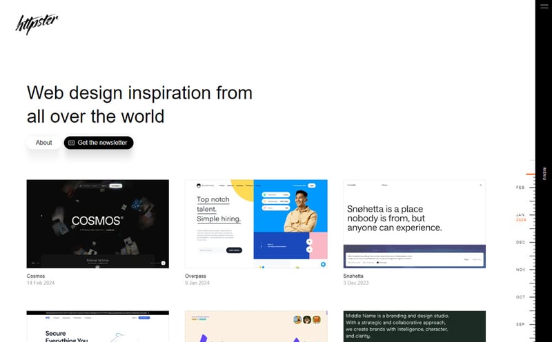
Httpster
Httpster showcases only the finest web designs from accomplished agencies and creators. Items are carefully selected based on good typography and simple efficient designs. One of the highlights is the collapsed sidebar navigation which holds the categories. You get to choose between industry and design style.
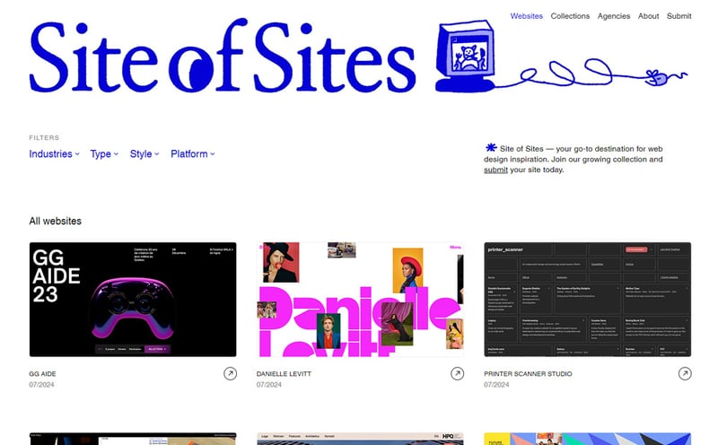
Site of Sites
Site of Sites distinguishes itself due to the large wide header preview covers and useful tags which appear on hover. It's a great destination for web design inspiration that's easy to browse thanks to multiple filters. Detail pages feature website bits and pieces structured as grid layout.
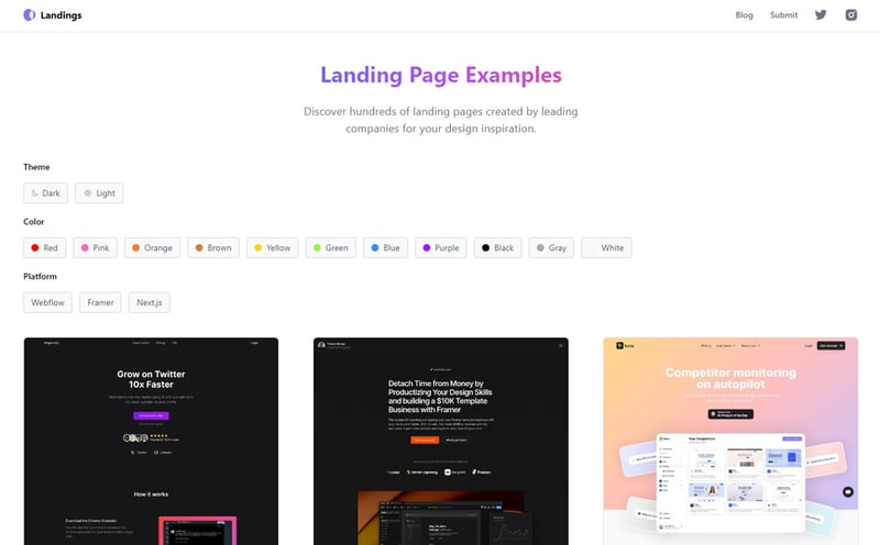
Landings
Landings is a great inspiration source for website design ideas especially landing pages. You get to browse through SaaS, mobile app, product and startup items but you can't filter by use case. Filtering is possible by dark/light theme, color and platform.
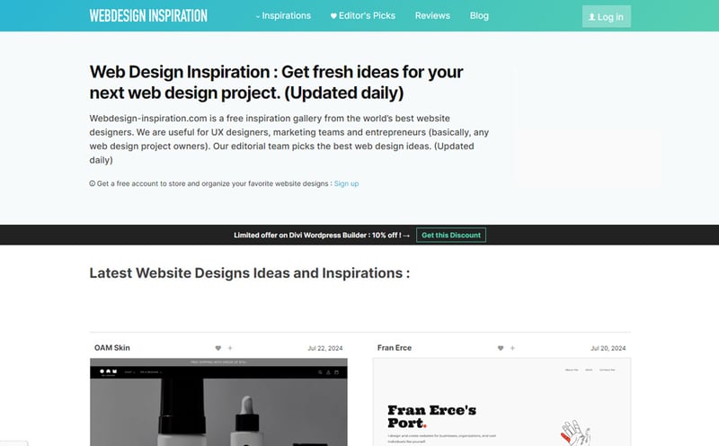
Web Design Inspiration
Web Design Inspiration is a solid choice to get ideas and examples. It has an extensive item library and you get access to multiple common sense filters. Use case, colors, design style and more. Extremely useful with one mention that ads can be intrusive for some.
Curated
Curated is a useful inspiration gallery packed with website examples structured on popular use cases. Filters include style and imagery type among others. What makes Curated stand out from the crowd is the unique item details page. No need for scrolling over a long screenshot. Instead you get a video where the scrolling is done for you.
Admire The Web
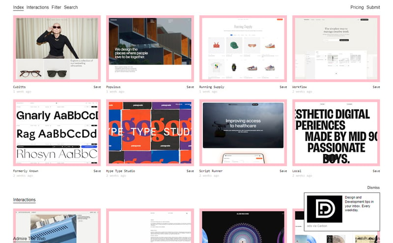
Admire The Web is a beautiful web design ideas source with clean and modern design. There are no pesky ads to hinder the browsing experience. Each item has a cool pink border and a dedicated details page. Besides the necessary filters, items are also categorized by tags.
Designspiration
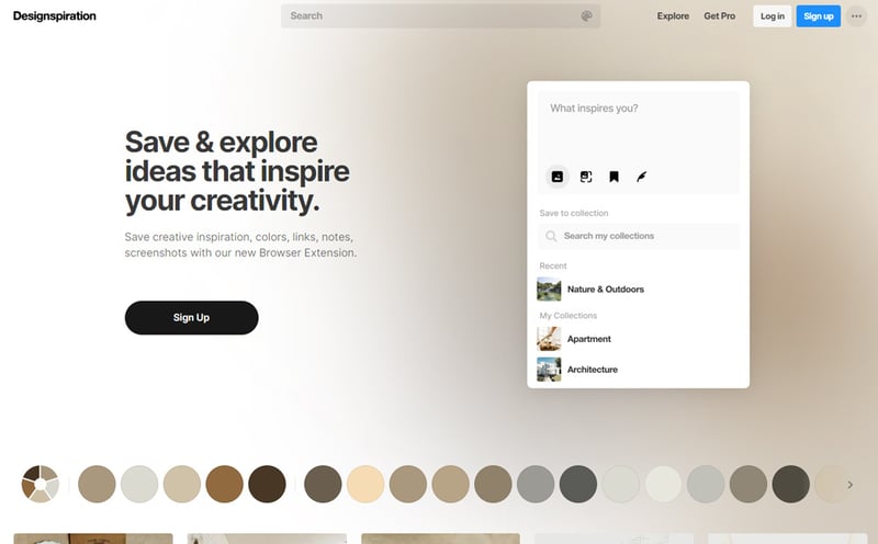
Designspiration covers a broader range of inspiration types like packaging, apps, architecture, interior design, photography, calligraphy and such. The website design category is generous but it doesn't feature the usual filters you'd expect. Also you need to sign up to see the full listing. Once registered you get extra functionality like saving and categorizing your own inspiration.
Best Website Gallery
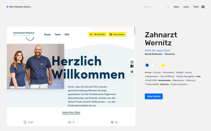
Best Website Gallery is a well structured web design inspiration resource founded and maintained since 2008. While it doesn't provide a huge number of items, the ones on display are thoroughly curated by an accomplished designer. A great feature is filtering by platform and CMS.
Lookup
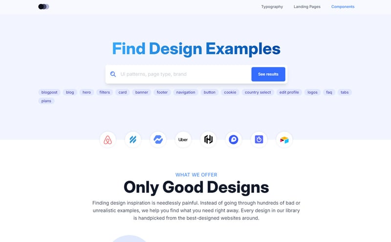
Lookup is a web component gallery first and landing page inspiration showcase second. The homepage greets you with a search box for quickly finding component examples. Choosing landing page from the menu opens up the full page gallery. Unfortunately there are no categories to filter results.
Unmatched Style
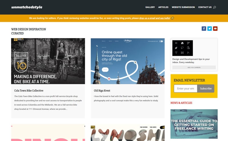
Unmatched Style is a generous web design inspiration gallery that showcases creative examples for a wide range of topics. You can filter the results by a set of tags which unfortunately aren't the most common or popular. Anyway the item selection is quite interesting and unique.
Focused inspiration
Resources that provide inspiration for certain use cases like SaaS, agency, ecommerce or design style like dark mode.
Saaspo
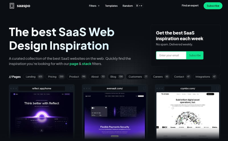
Saaspo takes SaaS website design inspiration to a different level. The gallery is wrapped in an immersive dark theme making items look even more special. You are spoiled for choice with over 600 landing page examples. Alongside them you will find dedicated categories for product, pricing, about, contact pages.
SaaS Landing Page
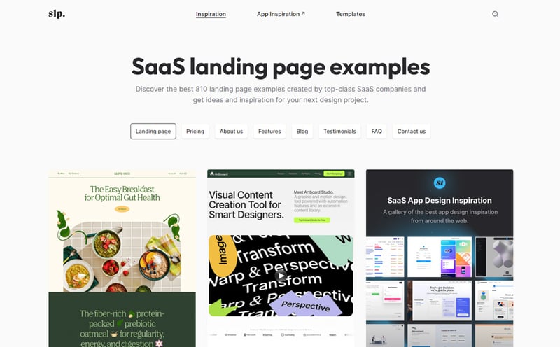
SaaS Landing Page is a beautiful gallery of landing page focused web design inspiration. The featured examples are manually curated by accomplished product designers. You'll see a lot of different styles from results oriented to creative, from minimal to crowded, from monochromatic to vividly colored.
Best Agency Sites
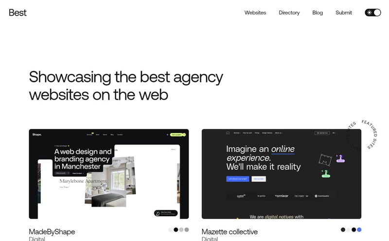
Best Agency Sites is a modern looking design inspiration gallery dedicated exclusively to agency websites. The high contrast layout with thin typography demonstrates the curator's fine taste for design. Each item gets a wide header preview cover and full screenshot on the details page.
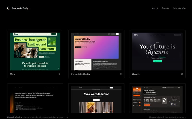
Dark Mode Design
Dark Mode Design is an immersive web design inspiration resource focused on showcasing dark mode websites only. The interface is dark too so everything looks extremely stylish even if a bit rough on the eyes in some areas. I couldn't find any meaningful filters but it's not mandatory to have them.
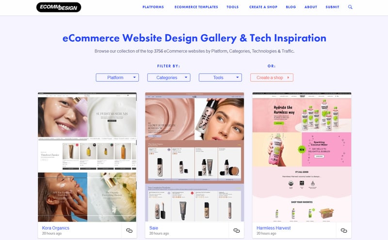
Ecomm Design
Ecomm Design provides ecommerce design inspiration primarily based on down to earth, results oriented examples instead of boutique masterpieces. I like this approach sine ecommerce is about selling not about design awards. Another thing that I like is the filter set which is useful and makes sense.
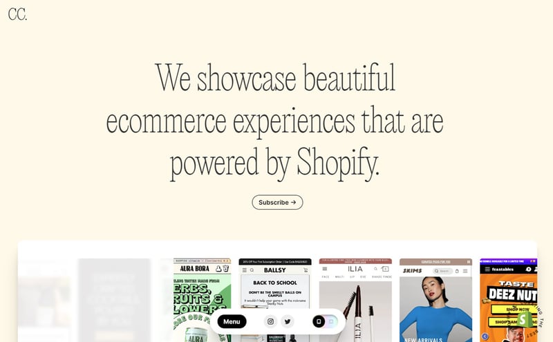
Commerce Cream
Commerce Cream narrows down even more the ecommerce design inspiration niche. It showcases online shops built exclusively with Shopify. Which doesn't sound so unusual if you consider that Shopify is the largest ecommerce platform. You can filter the results to your preferred use case.
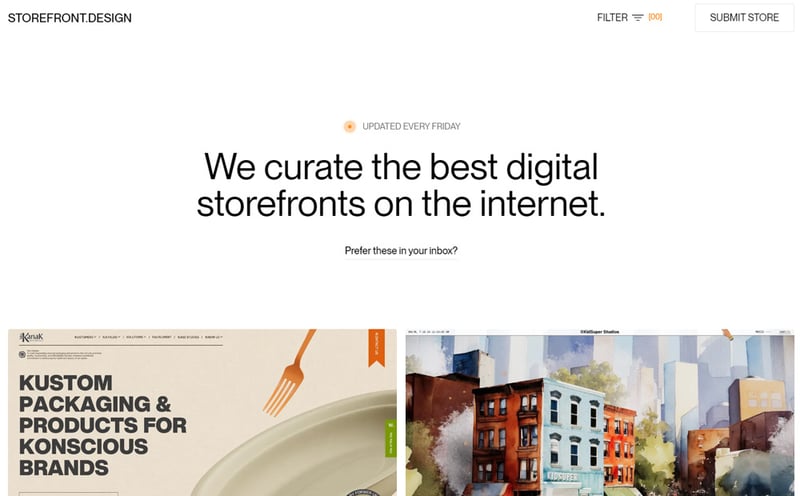
StoreFront
StoreFront has you covered with a curated collection of unique ecommerce homepages that's updated weekly. The comprehensive filter set proves that StoreFront is a fully fledged gallery not the usual half baked inspiration project. I just wish that covers would load faster, the only minor caveat.
Personal Sites
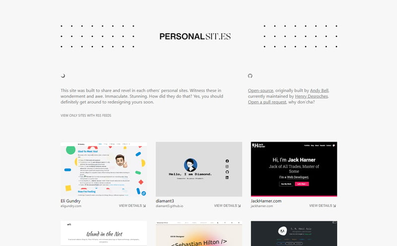
Personal Sites is a one page collection of inspiring personal websites. Improve the way you present your brand, expertise, services and contact means by taking inspiration from these curated examples. No filters to refine results, you'll just have to keep on scrolling.
Killer Portfolio
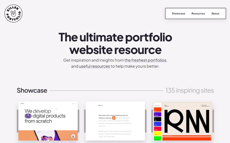
Killer Portfolio is a top resource to learn how to present yourself, your skills and completed projects in order to get work and collaboration requests. Each cover is decorated with a unique animated frame on hover. You get to choose between a few useful tags like design, development and video.
Pafolios
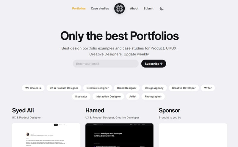
Pafolios is a unique portfolio inspiration gallery carefully curated by an accomplished product designer. The design is appealing and makes you feel like visiting a modern art gallery. There are a couple of useful categories available like designer, developer, writer, illustrator and more.
Niched inspiration
Narrow scope websites that are niched on particular website sections, design style and animation intensity.
Unsection
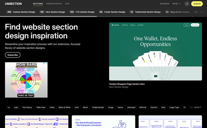
Unsection is a beautiful web design inspiration gallery featuring an immersive dark theme with yellow highlights. It focuses on website sections like hero, features, CTA, testimonials, blog, navbar and so on. These are the main categories but you also get to select tags like type, industry and style.
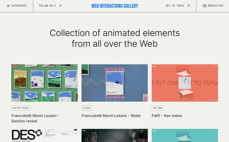
Web Interactions Gallery
Web Interactions Gallery is unique because of its highly focused specialization. Beautiful and smooth animations for different parts of web layouts. It's quite an exciting website showcasing how you can bring user experiences to life. Categories are well thought out and make navigation a breeze.
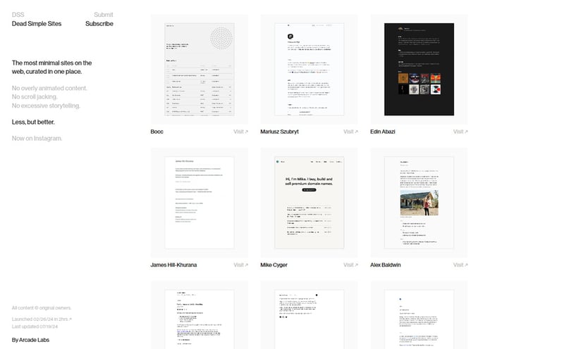
Dead Simple Sites
Dead Simple Sites is a minimal design inspiration gallery comprised of simple websites with basic layouts. A true testament of less is more mantra. Give it a spin if you're looking for spartan designs that easily get the message across with little to none superfluous decorations.
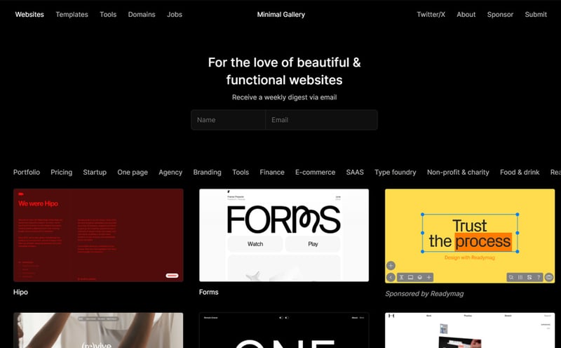
Minimal Gallery
Minimal Gallery as the name suggests curates website design examples with simple layouts but not necessarily less interesting. The chosen designs cover a plentiful range of tastes from monochromatic and quiet to vibrant and loud. Use case based categories are easily accessible in the filter bar.
Siiimple
Siiimple is a minimalist CSS inspiration gallery featuring hand-picked designs from all over the internet. You get a large categories menu with multiple options. The only minor downside is that filter items are mixed together and not grouped in topics like you'd expect.
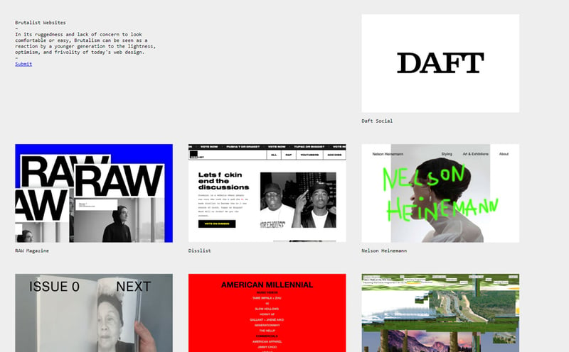
Brutalist Websites
Brutalist Websites is a raw collection of characterful websites that stray away from the beaten path. Nothing here adheres to the norm. Every selected item is unique and unusual. Feels like an experimental gallery of the unconventional leaning towards form over function.
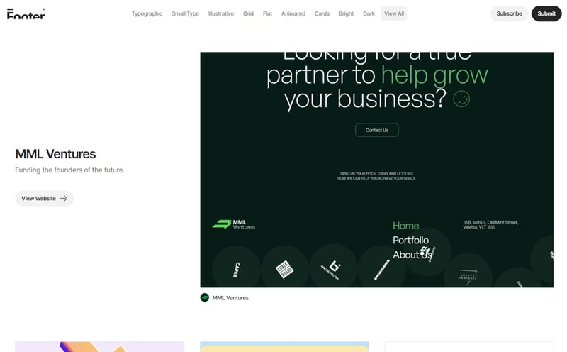
Footer
Footer satisfies the lust for visually appealing footer sections with a comprehensive gallery on the subject. There is no more excuse for boring footer areas. Take inspiration from hundreds of examples neatly structured by logical filters. Animated, flat, grid, bright, dark and more.
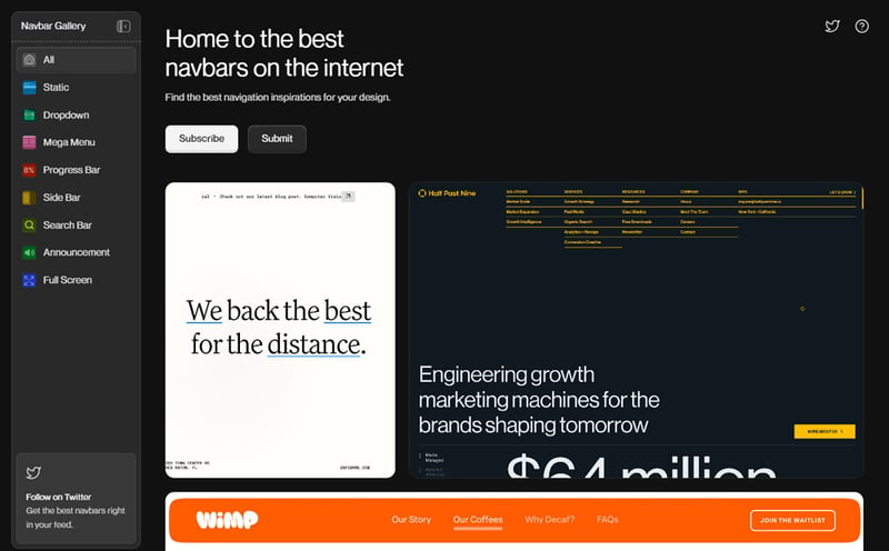
Navbar Gallery
Navbar Gallery is an impressive source of design inspiration dedicated entirely to website navigation bars. Hundreds of navbars have been carefully curated by the maker and neatly structured on specific categories. The interface is wrapped in dark mode and features a beautiful and ergonomic sidebar navigation.
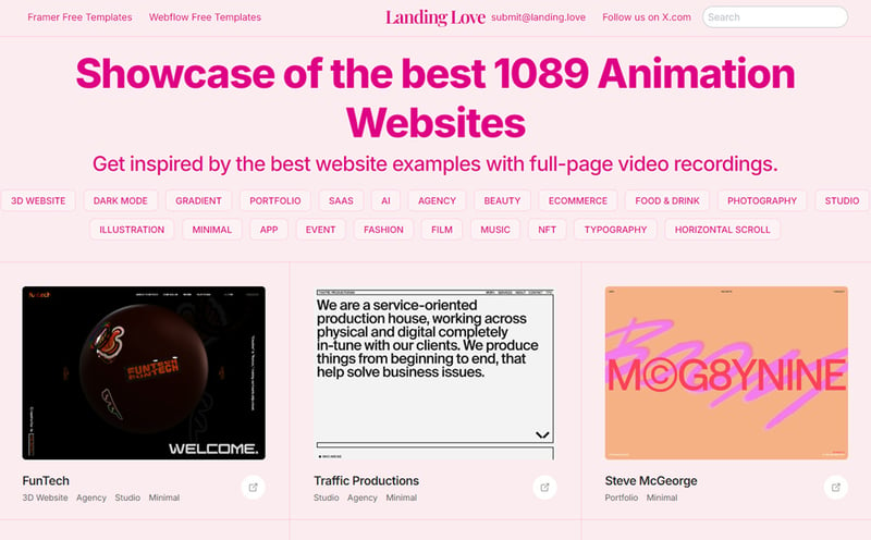
Landing Love
Landing Love is a generously curated collection of animation heavy websites. If you're looking for ideas on how to make your webpage more dynamic then you're in the right place. All covers are video recordings of the examples in action. Landing Love's interface is based on a joyful pink based color scheme.
Hover States
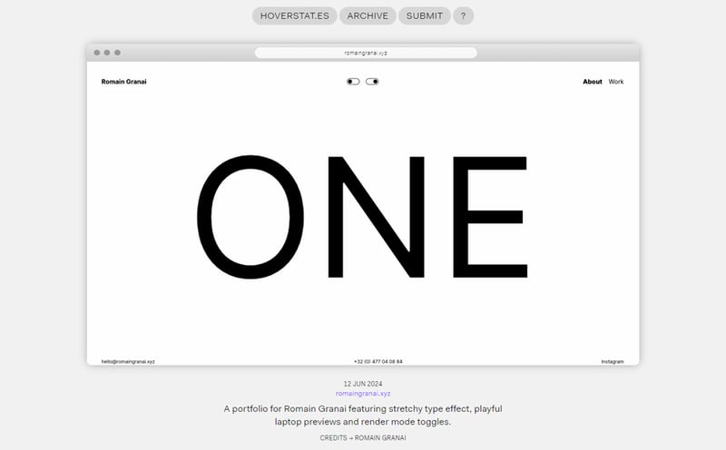
Hover States is an out of the ordinary library packed with alternative website examples celebrating experimentation with design, code and interactivity. You will definitely find some interesting items that will stir up your imagination. To improve the experience covers are animated on hover.
The Whimsical Web
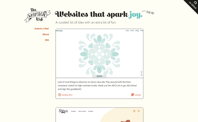
The Whimsical Web is the home of quirky and fun web design ideas. It's the kind of place where you relax and enjoy crazy creations than a source of inspiration for work. Examples are showcased in a timeline format that keeps you scrolling forever.
Recent Design
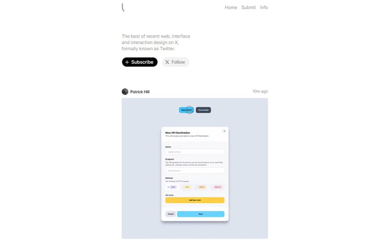
Recent Design showcases the latest design inspiration posts from X. Whether it's web, desktop, mobile, interactions everything is mixed together in a timeline format. It's a great way to see what designers and makers have been up to lately whether it's experimenting, freelancing or building own products.
Paid inspiration
Commercial website inspiration galleries that offer huge amount of items and extra features for a decent fee.
A-fresh Website
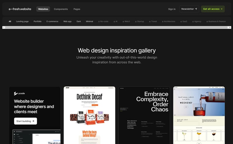
A-fresh Website is a meticulously curated web design inspiration library providing thousands of examples to elevate your aesthetics. Logical categories and popular tags make for a pleasant and efficient browsing experience. Besides homepages you can also find components and mobile views. Payment enables access to all content.
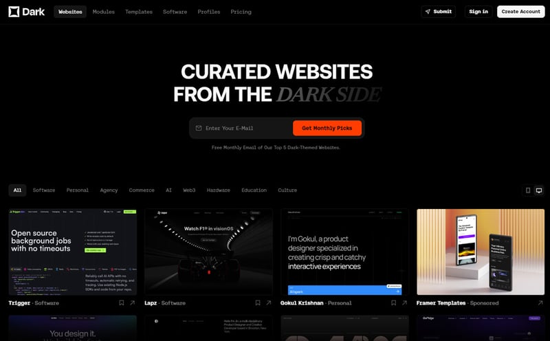
Dark
Dark is a comprehensive collection of dark website examples for design inspiration. The selected items are unique and can definitely get your creative juices flowing. Everything is wrapped in an elegant dark theme for the users delight. Payment unlocks the entire directory and mobile views.
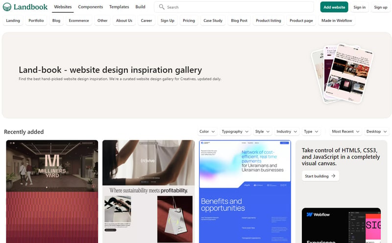
Landbook
Landbook provides thousands of great web design ideas in a beautifully styled gallery. Filters are logically layed out with main categories at the top and secondary criteria positioned lower on the page. In addition to examples you will find components and templates. Payment unlocks the entire potential.
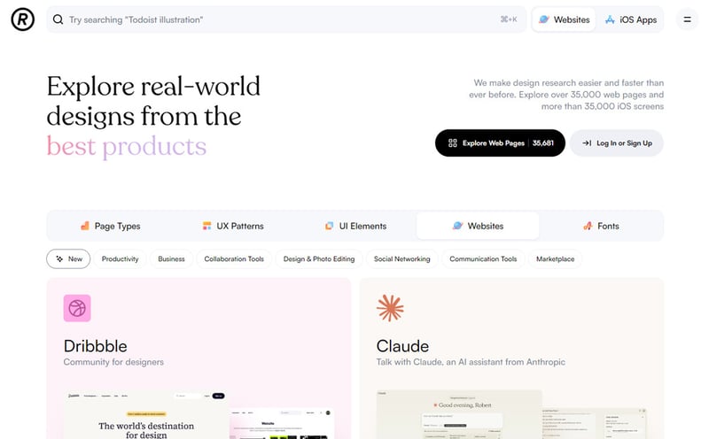
Refero Design
Refero Design is a huge design inspiration library going past web stuff to include UI elements, UX patterns and fonts. The websites section features beautiful covers which portray both layout and branding for each item. Unique approach which I haven't seen on any other gallery. Payment unlocks complete details.
Real work and concept portfolios
Online portfolio websites where creative individuals, small studios and popular agencies showcase their projects.
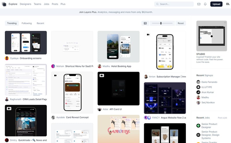
Layers
Layers is a platform for designers and makers to showcase their projects, concepts and anything that inspires them. It's similar to Dribbble offering interaction with peers, job and collaboration opportunities. I loved the feature that allows you to change the covers size and details.
Behance
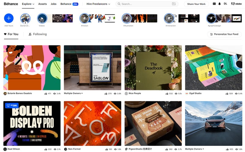
Behance needs little introduction since anyone involved with design knows about it. Although lately it has lost some the popularity it still is one of the largest platforms where you can indulge in the latest design trends.
Dribbble
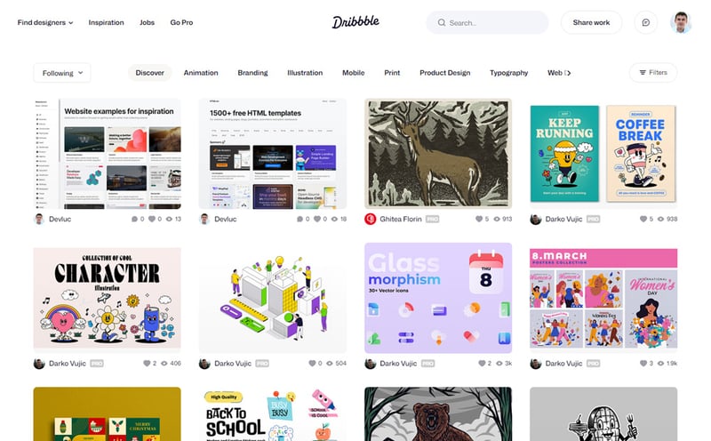
Dribbble is a familiar resource for creatives worldwide. It offers a convenient way to showcase design portfolio works and get feedback on them. That means inspiration is abundant with thousands of items for web, mobile, UI and print. The vast amount of examples itself makes it somewhat cumbersome to explore.
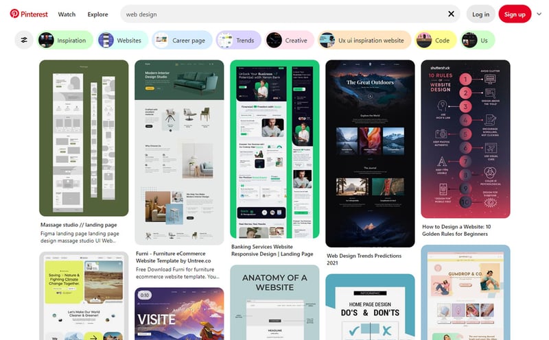
Pinterest exists to offer design ideas for just about anything. It probably is the largest inspiration gallery in the online space. Unfortunately unlike other galleries it's free for all and not curated. You will stumble on many low quality posts which eat up research time.
Award galleries
Besides web design inspiration these galleries provide an idea of what industry professionals think about each entry.
Awwwards
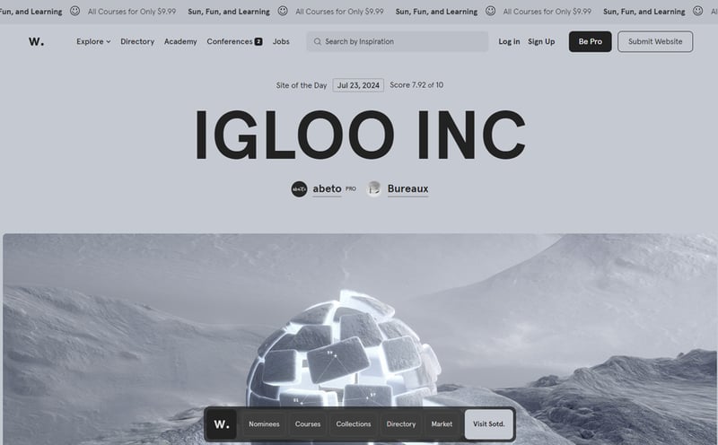
Awwwards is the web design gallery exclusively curated by industry professionals. Each day website entries are rated by experts and awarded the prestigious badge if they meet the criteria. Expect to find art and animation heavy designs focused on visual impact rather then efficiency for business results.
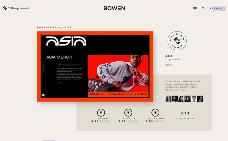
CSS Design Awards
CSS Design Awards is a stylish web gallery where top creators submit their work to get feedback from leading design professionals. You can browse the winners and also the nominees. There's a lot to learn from both sides. Common sense filters are present like industry and color.
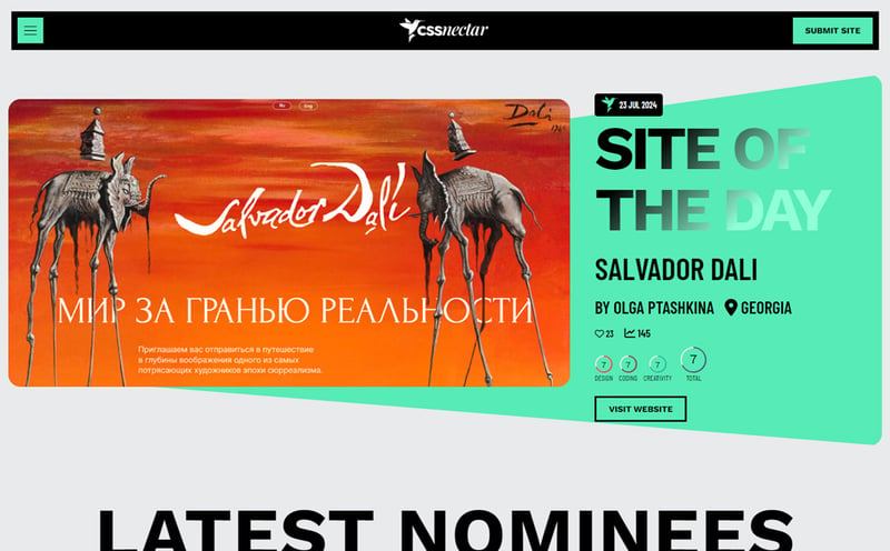
CSS Nectar
CSS Nectar is an awesome web design awards gallery that collects and rates a wider range of entries compared to other galleries. You get to discover and take inspiration even from more approachable examples not just masterpieces built by dedicated creative teams. Use case filters are present to make selection easier.
Website builder galleries
Website builder showcase galleries offer huge amounts of inspiration for the ideas hungry web designer. Here are the most popular.
- Wix Websites great suggestions for portfolio, ecommerce, business and restaurant
- SquareSpace Showcase best for portfolio, ecommerce, blog, restaurant, SMB
- Framer Gallery largest category base for the widest range of projects
- Made in Webflow useful search box but mixes templates with examples
This list is based on many blog posts, X roundups, design directories that I collected over a few years of web design and frontend development work. I've filtered out a lot of crappy resources to save your time and make your work more enjoyable.
